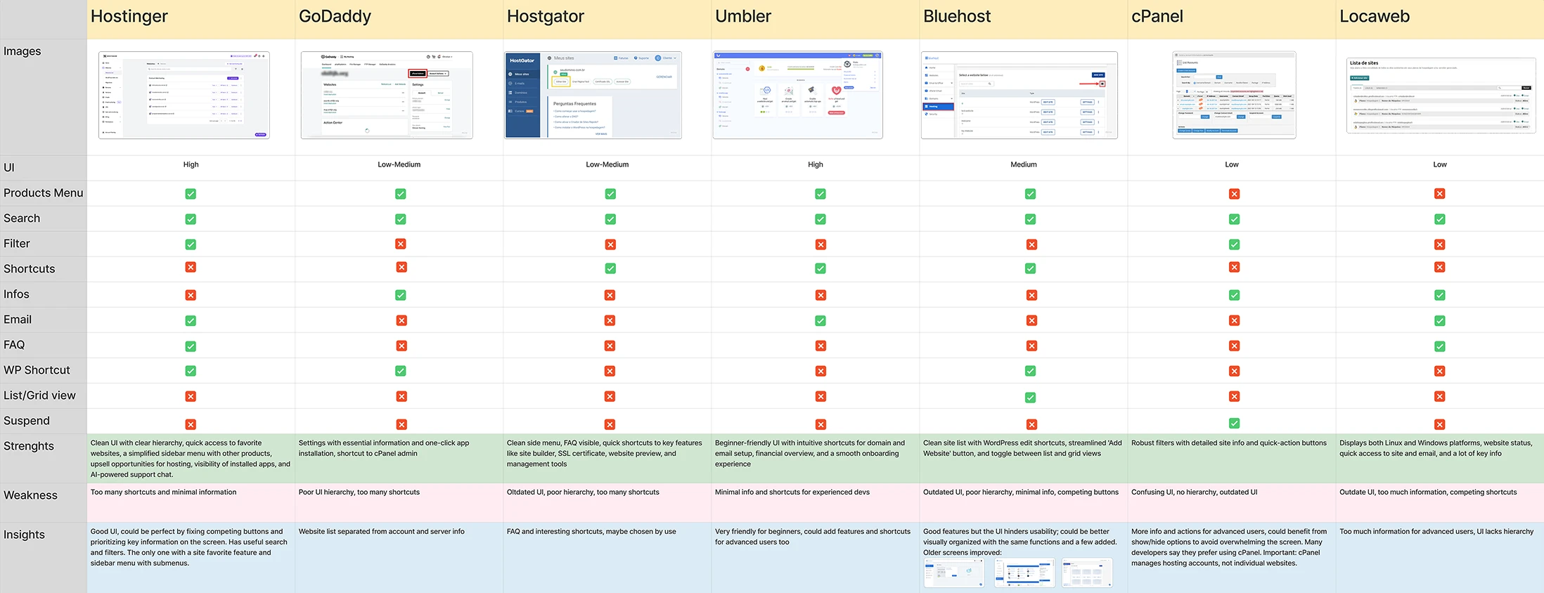
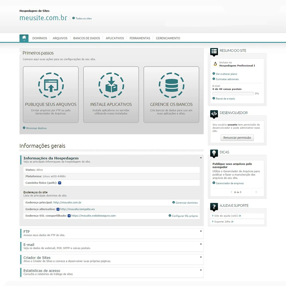
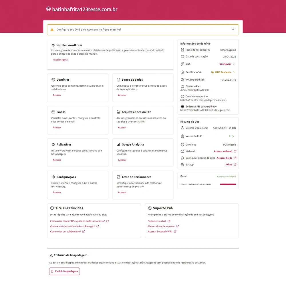
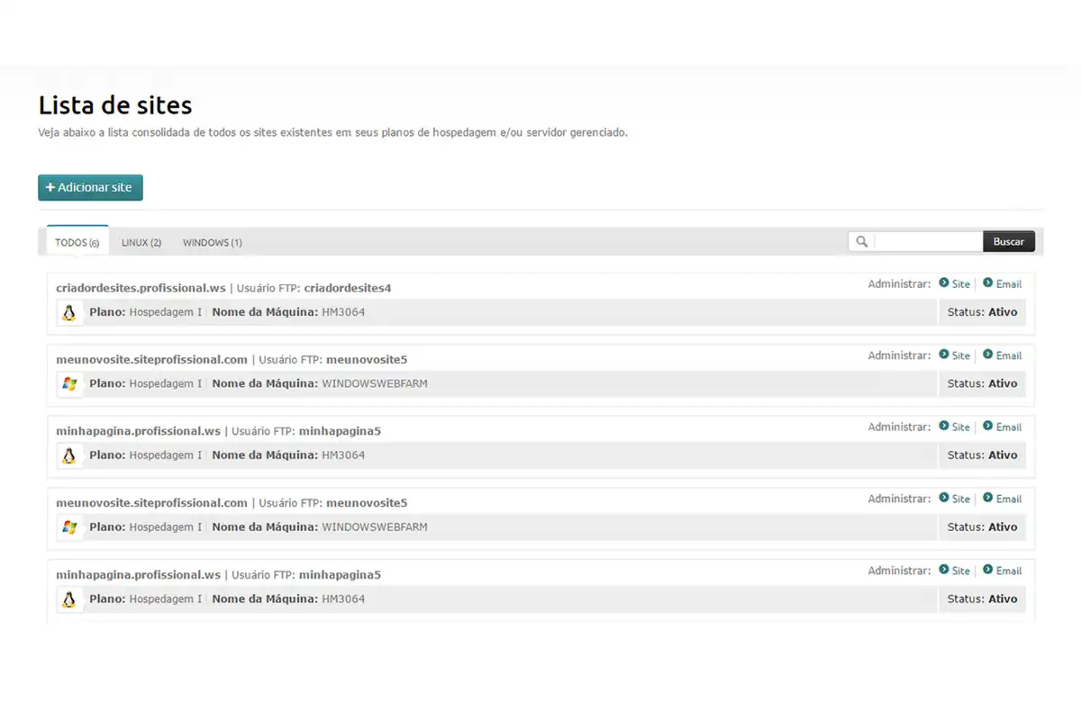
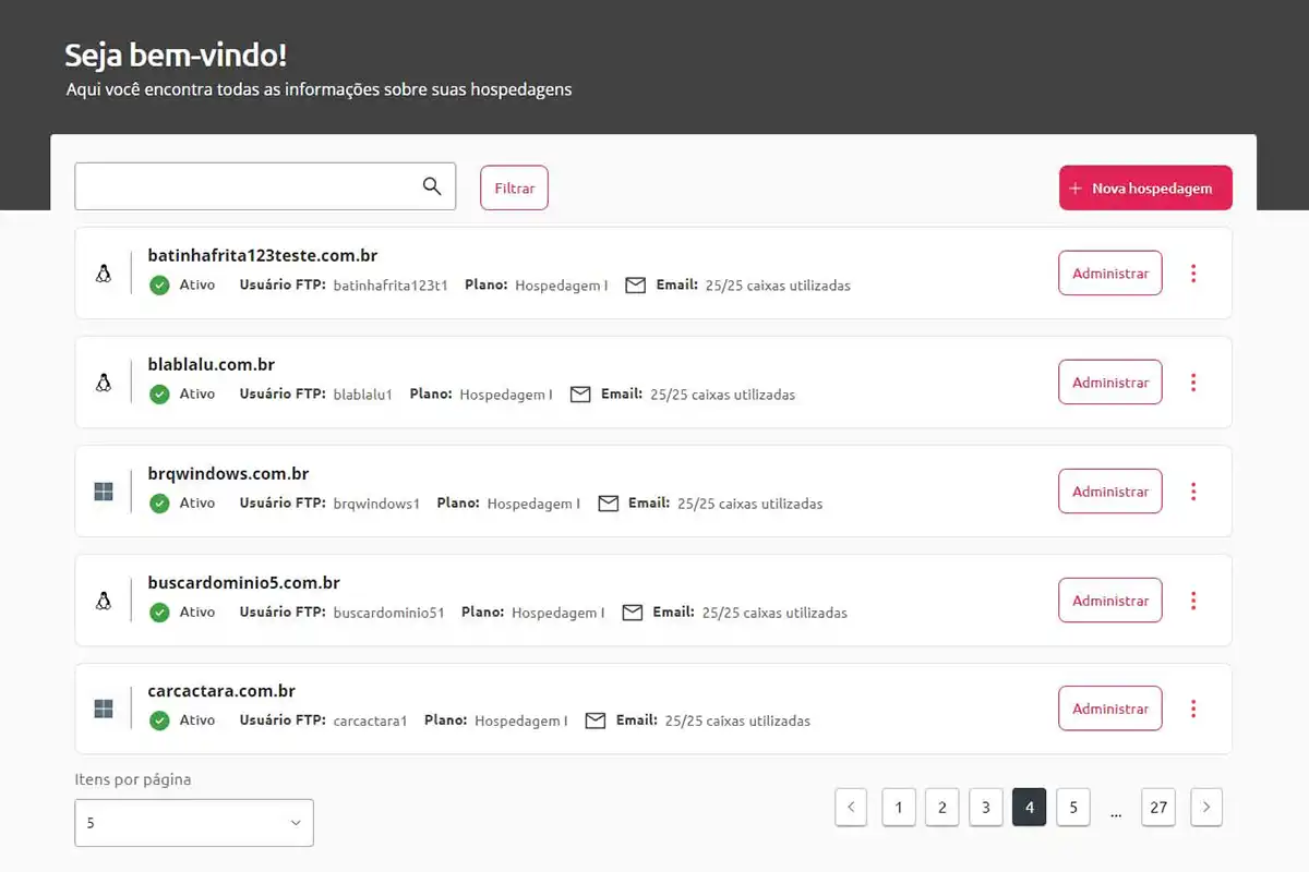
Action & Research
Design Discovery
Key Takeaways
01
All participants used a combination of multiple apps to find, book a cab or rent a car
02
Users value the ability to detect the damage to car immediately which reflected a sense of satisfaction for the rent-out feature
03
Major products in the market lack desirable features and feel impersonal, outdated and untrustworthy
04
A compare feature with relevant information is paramount when searching for cars.
05
Too much information on screen makes users feel overwhelmed, they'd like a more curated experience
06
Irrelevant suggestions feel impersonal and clutter the UI, filters are highly used tools when searching
Space Planning
Lorem ipsum dolor sit amet, consectetur adipiscing elit. Mauris accumsan urna eu pharetra elementum.
Custom Furniture
Lorem ipsum dolor sit amet, consectetur adipiscing elit. Mauris accumsan urna eu pharetra elementum.
Furniture Layouts
Lorem ipsum dolor sit amet, consectetur adipiscing elit. Mauris accumsan urna eu pharetra elementum.
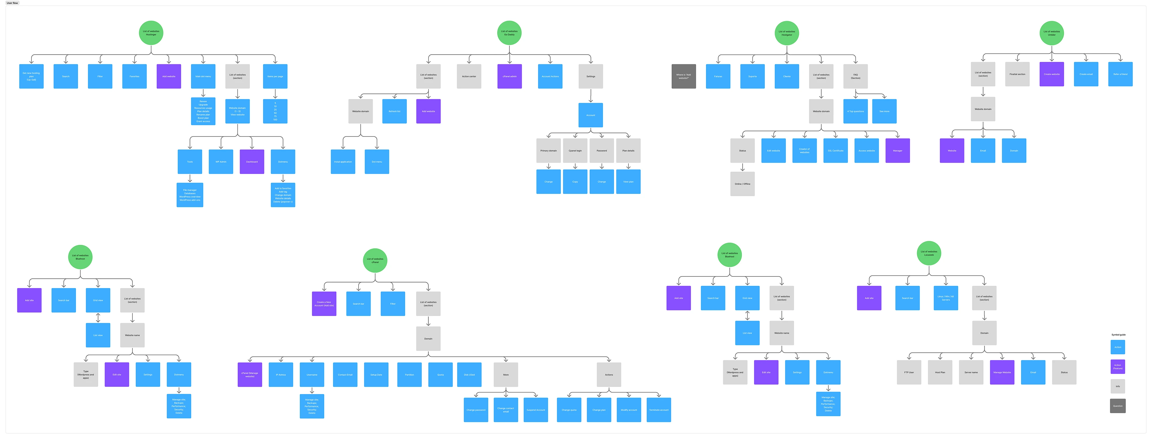
Action & Information Architecture
User flow